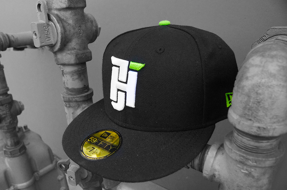
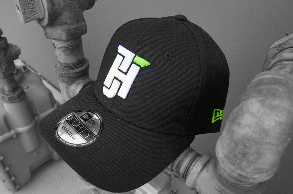
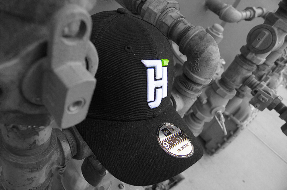
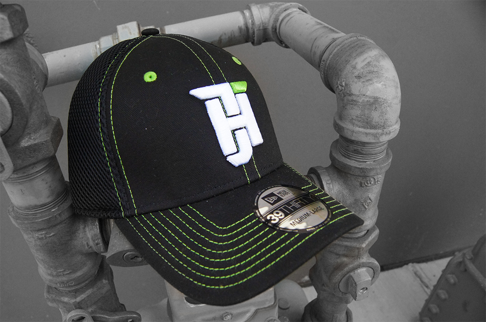
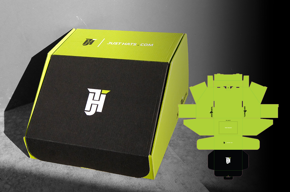
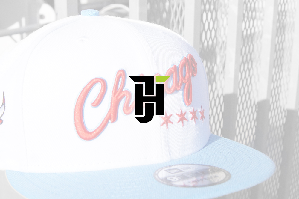
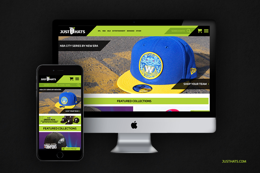
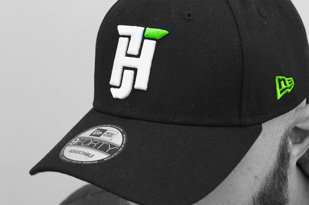
Kenny Mortimer Design logo
Close-up of Just Hats cap embroidery

Just Hats

Headwear branding built to hit hard.

Client Fanzz Sports Apparel team
Disciplines Branding, packaging, product styling, UI/UX
Goal Build a focused headwear brand with a scalable retail system

Overview

A focused brand built to scale

Developed with the Fanzz Sports Apparel team, Just Hats was built as more than a logo on product. The goal was a complete brand and shopping experience focused on headwear, with room to expand through segmentation, merchandising, packaging, and broader retail growth.

Brand board showing the Just Hats identity system
Just Hats wordmark over blurred cap background

Identity System

A mark built for every touchpoint

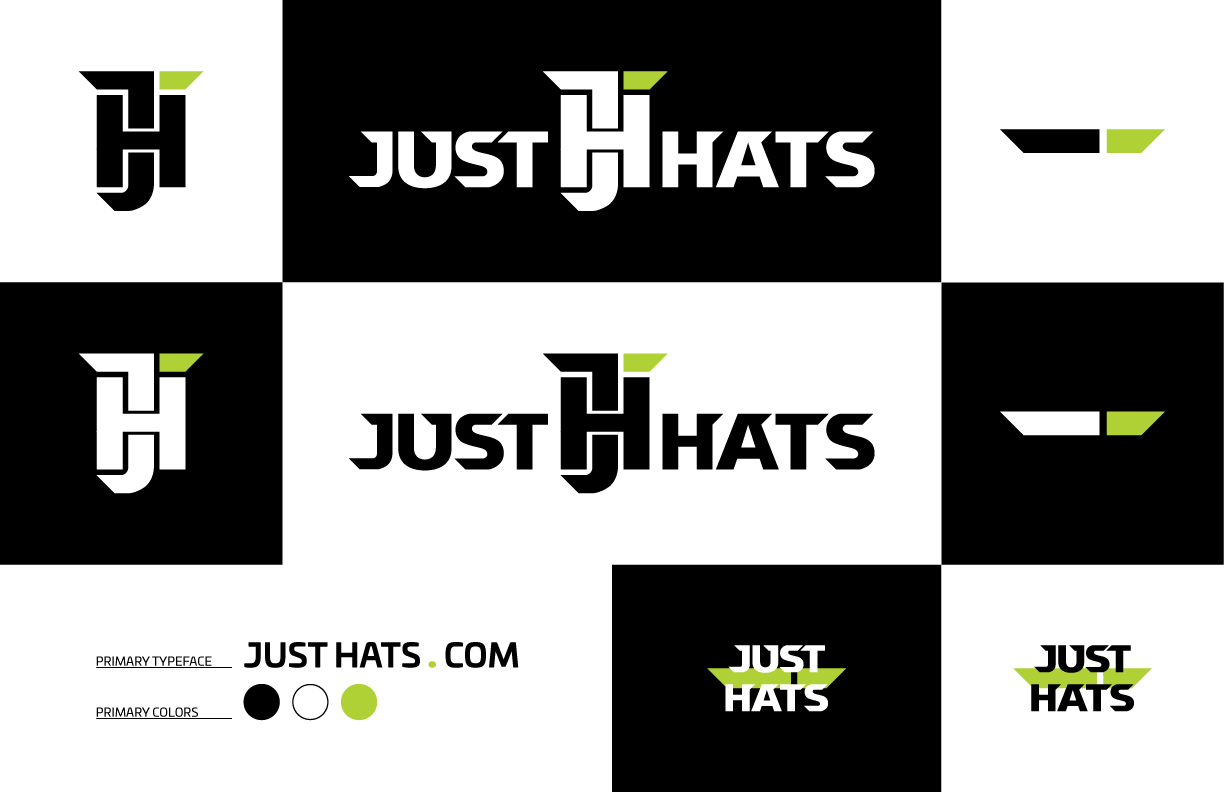
The identity is built around a compact angular monogram and a sharp wordmark that can move between stitched product detail, shipping materials, and digital UI without losing recognition.

  • High-contrast black and white foundation.
  • Acid-lime used as a controlled signature accent.
  • Symbol and wordmark variants tuned for multiple contexts.
Just Hats logo over moody cap photography
Just Hats stacked wordmark variation

Product Application

The brand had to work on product

The cap mockups prove out the identity where it matters most. Stitch density, silhouette, and close-up material contrast all reinforce the sharper industrial tone of the brand while keeping the green accent highly legible.

Close-up of Just Hats cap embroidery
Just Hats branded packaging system with dieline

Packaging

Simple structure. Strong recognition.

Packaging extends the same visual logic into fulfillment. Black structure, large lime panels, and a reduced mark create something memorable without becoming expensive or overbuilt for a retail-ready shipping system.

Digital Experience

An ecommerce experience built for discovery

The UX translates the brand into a merchandise-led storefront with strong hierarchy, promotional modules, and clear segmentation by style and interest.

Desktop homepage design for the Just Hats website
Mobile homepage design for the Just Hats website

UX Rationale

Large category tiles, bright promotional bars, and a strong black header make the shopping experience feel energetic and merch-first rather than generic. The layout suggests a business model with room for multiple audiences, styles, and future product branches.

Selected Frames

The system in use

Just Hats supporting brand image one
Just Hats supporting brand image two
Just Hats supporting brand image three
Just Hats supporting brand image four

Key Takeaways

What this project sharpened

Just Hats expanded my ability to think about a brand as a connected system rather than a set of isolated deliverables. Working across identity, product application, packaging, and ecommerce UX strengthened how I approach cohesion, visual hierarchy, and the translation of a concept across physical and digital touchpoints.